Responsive web design and adaptive web design are two approaches to web designing that can be employed to create a smart UI and UX design of a website suitable for all devices. They are similar and different at the same time, but which one is better? In this article, we’ll define the differences between responsive and adaptive web design and find out which one is better for you to choose.
What do we call an RWD (responsive web design)?
In 2010, Ethan Marcotte, a web designer, published the article called “Responsive Web Design” where he described a new approach to web designing that provides adaptation of a content on a website according to the width of a device screen. In a while, responsive web design has become a popular approach to designing websites, and Marcotte’s book is a handbook of RWD for many designers.
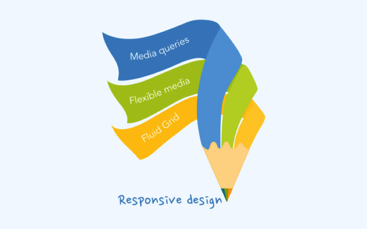
The basic rule for creating RWD of a website – it should include three vital components:
An adaptable base
As I said, RWD changes the content on a website relatively to the width of a device screen. That’s why it requires only one but an adaptable layout. So, how can you make content on a web page change the size? All you need is to employ percents or ems for fonts in lieu of pixels, and, in this way, all components on a web page will change proportionally. For example, if a text block takes 65% of place on a page on a PC screen, it will remain so on any other device screen.
Flexible visual content
While creating RWD, don’t forget media content. Pictures and videos should not only change their size according to a screen’s width but also they should adjust to a content block. That’s why you have to establish maximal width for media components, so they won’t become wider than a content block.
Media queries
Media query one of the CSS techniques. It is used to identify proper set of style that needs to be applied to web pages. There is three major set of style that designers apply while creating an RWD: a mobile set, a computer set, and a tablet set. However, it’s up to you how many styles to apply more or less.

What do we call an adaptive design (AWD)
Adaptive design and RWD have the same aim, although, they have different methods. While RWD needs one layout with flexible content, adaptive designing requires set of layouts, each for a specific device.
This approach allows creating UX for a website that will be good not only on devices with small screens but also for those with the highest resolution. Well, obviously, you don’t need to make as many layouts as many resolutions exist. You have to decide which devices your potential users might prefer.
What strategies do designers need to follow to create AWD?
There are two strategies that you should learn if you’ve decided to make an adaptive design.
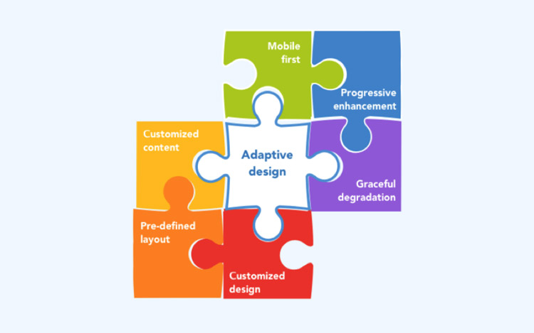
The first strategy is known as a progressive enhancement. According to this strategy, a designer needs start making a design with the standard UX suitable for old browsers at the first place. And only after this, designers create a design for more advanced browsers.
The other strategy works otherwise. Following a graceful degradation strategy designers at first create a website which has a smart UX design for modern and advanced browsers. In this case, a website will look properly on old browsers, not perfectly, but yet user-friendly.
You may ask which is better? Well, I can tell you that progressive enhancement is more convenient to follow because at every stage you’ll get a complete product, ready for using, and it becomes better with every next step. This strategy gives an opportunity to get a ready to use product really fast
And, one more thing about AWD. If your task number one is creating a mobile website, then you have to take a close look at the principle called “mobile first”. Actually, it’s pretty similar to progressive enhancement methods, although it applies more to mobile websites.
The main idea is that a designer at the first place should create a design for a mobile website, making sure that UX is smart and user-friendly. Only then all other versions can be created, but it’s optional.

Comparing: RWD vs AWD
Responsive Designing
Pros:
- One single URL for every version makes a website easier to promote.
- RWD will improve SEO of your website.
- UI of a website looks good on various devices.
- An appropriate UX on different devices.
Cons:
- There can possibly be a redundant amount of the content for a mobile version.
- It’s impossible to create a custom product for every modern gadget.
Adaptive Designing
Pros:
- An adaptive website can better define a device and its screen width.
- An adaptive approach allows creating a customized product for a specific gadget and predict its behavior.
Cons:
- Adaptive designing is more complicated and expensive rather than RWD. development process.
- The maintenance is more complicated as well as updating.
Summarising
When you should choose RWD:
- If your time and resources are limited;
- If you want to get a clean and simple design and functionality;
- If you want to ease the process of updating and maintenance of the site and make it faster.
When you should choose AWD:
- If you’re positive that your target audience will use a lot of different devices.
- If you’re ready to spend money and time on creating of several separate versions of your website.
I hope you’ll find this article useful, and to sum up, I’d like to say that both of these approaches have advantages and disadvantages and it’s absolutely your decision which one to choose.
About the Author: Alina Arkhipova is a Copywriter at Cleveroad Mobile and Web development company. We deliver winning software across the world for big businesses as well as for startups.